Creating posts, events and groups in ChurchTools Website works very similarly to creating pages. We therefore recommend that you first read the article How to create and edit a page?.
All three types of content are created using the same six tabs, which differ from each other in a few ways.
General (Allgemein) #
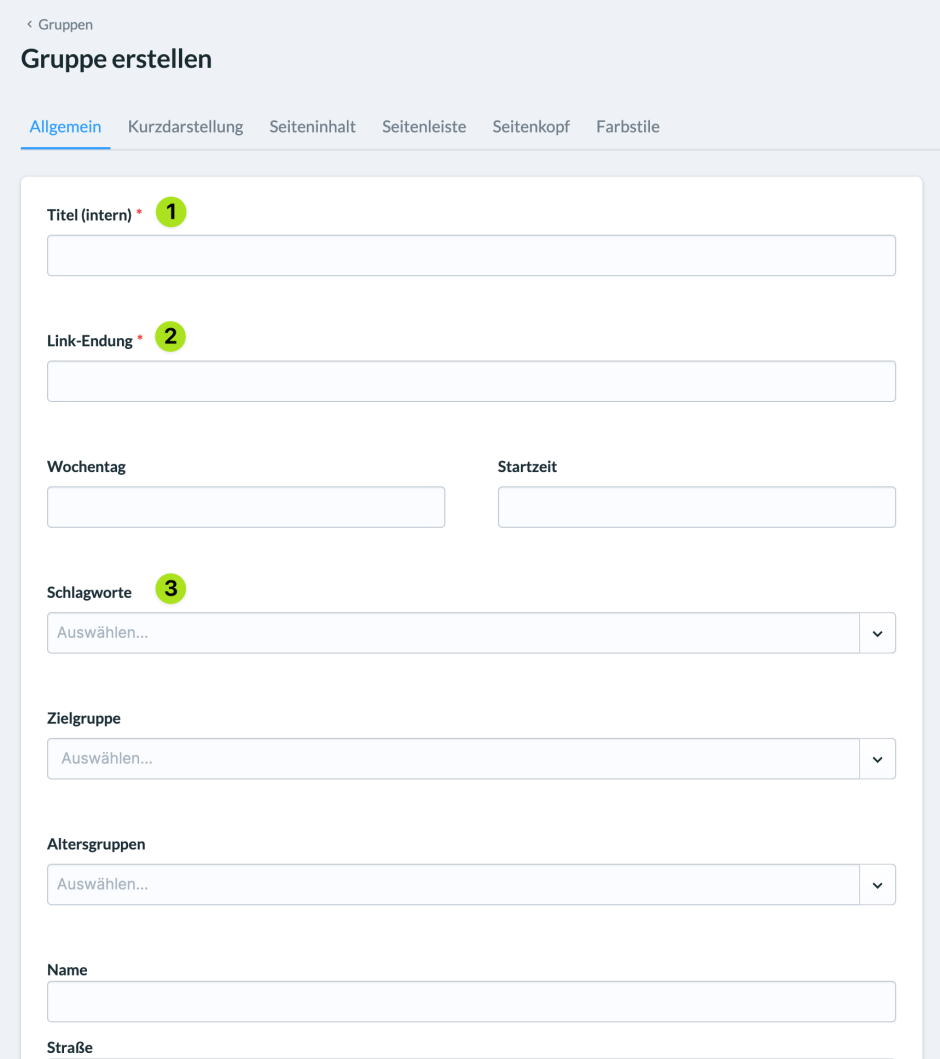
- Here you specify the Title of the content internally (Titel intern) (1) for all content.
- What you enter under Link extension (Link-Endung) (2) is the part that will later be displayed in the URL of the content e.g.
https://examplechurch.de/content/link-extension. - You can assign keywords (Schlagworte) (3) to all content, which can be filtered on overview pages.
Short presentation (Kurzdarstellung) #
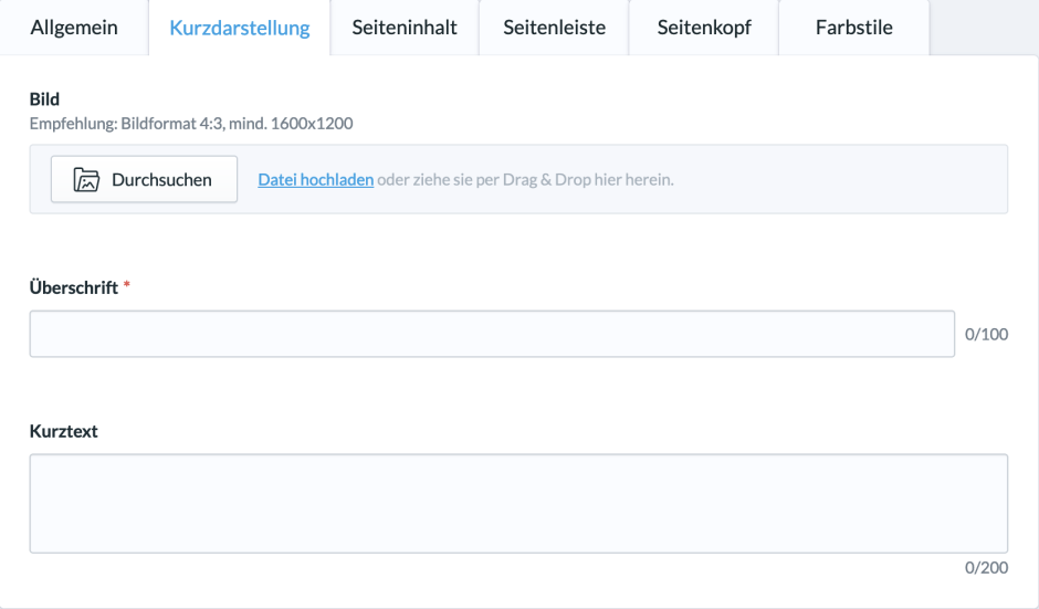
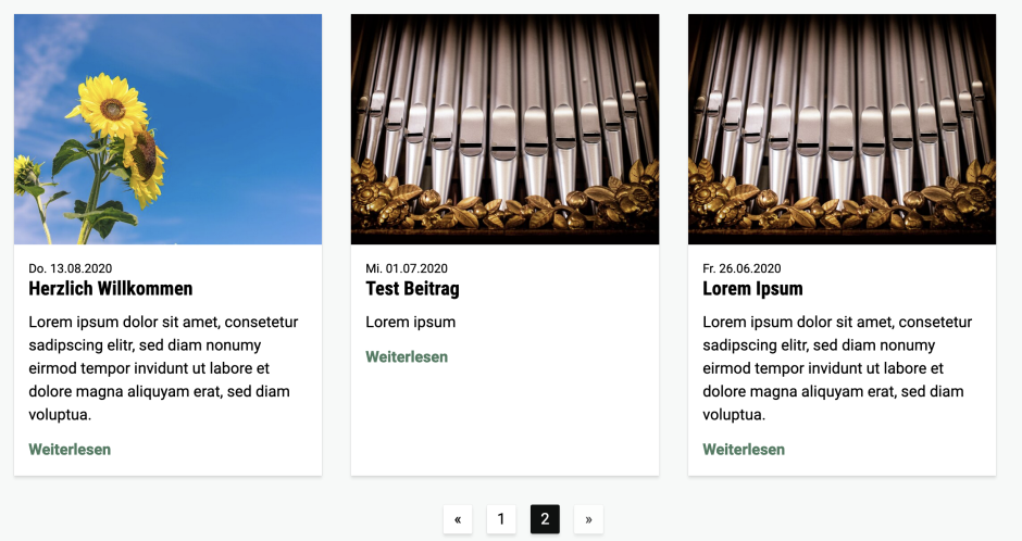
The Short presentation works the same for all contents. This tab determines what is displayed for the respective content in an overview page. In a way, it is the preview of the content.
It is composed of an image, a headline and a short text that is intended to convey to visitors what is behind the Short presentation.
Page content (Seiteninhalt) #
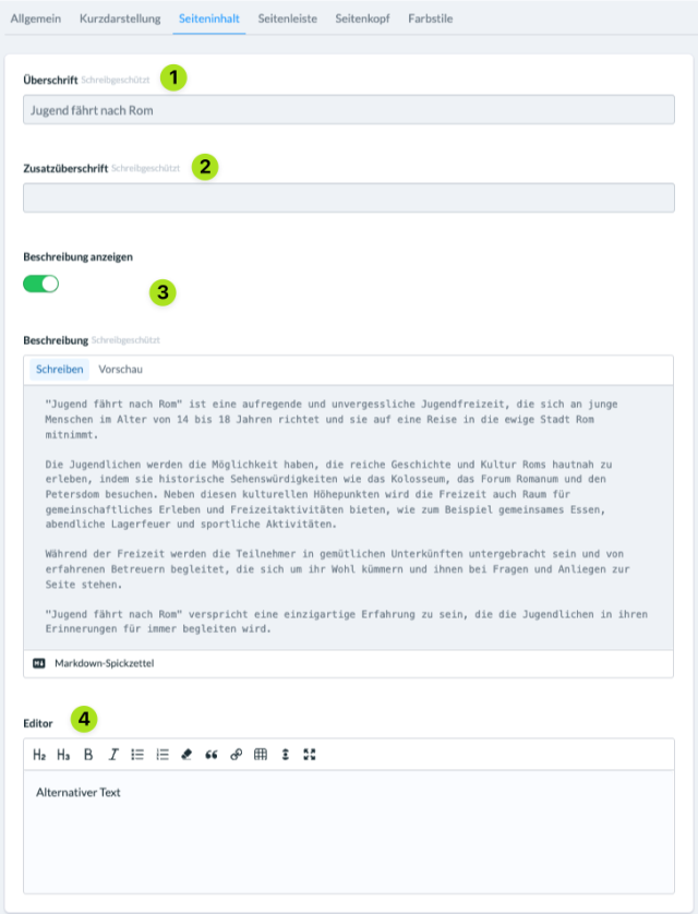
The tab Page content works the same for all contents and exactly like the page content of a standard page. Here you define what visitors see when they call up the content.
(1) Headline #
Here you set the heading of the page that users will see when they access the content.
(2) Additional heading #
A second, smaller heading that is placed above or below the heading, depending on the design.
(3) Display and edit description (for posts and groups) #
Here you activate an automatic extract from the description from ChurchTools. Alternatively, you can deactivate the description, in which case the text from the editor will be displayed instead.
(4) Editor #
In this editor, you compile the actual content of the page.
- Of course, you have a number of formatting tools at your disposal, such as boldface, lists, block quotations and links, to display text.
- You can also add elements using the “+” symbol.
- Elements are building blocks that allow you to add a variety of content to your page, such as images, galleries, audio, videos, expandable content, events and more. If you want to learn more about which elements are available, how they work and how they can be used, take a look at the articles linked at the end of the page.
Sidebar (Seitenleiste) #
What a sidebar is and how it works can be found in the article linked below.
(1) Hide sidebar (Seitenleiste ausblenden) #
If the switch is active, no sidebar is displayed.
(2) Create & link entry (Eintrag erstellen und verknüpfen) #
With this button you can create new sidebars and sidebar items.
(3) Select (Auswählen) #
Here you can select existing sidebars and elements that can be combined and extended with other elements.

Page header (Seitenkopf) #
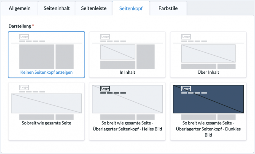
The page header consists of one or more slides that can be displayed in the header. Slides function according to the same principle as elements on portal pages. There are various display options, such as an image that takes up the background of the header.
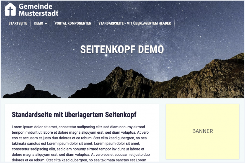
By default, the option Do not show page header (Keinen Seitenkopf anzeigen) is set. As soon as you select another display option, the option to add slides appears at the bottom:
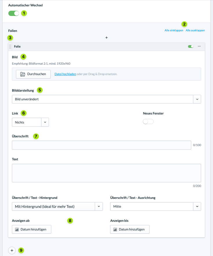
(1) Automatic change (Automatischer Wechsel) #
If several slides have been created, they change automatically as soon as this function is activated.
(2) Expand/hide all (Alle ein / – ausklappen) #
With these two options you can minimise or expand all slides.
(3) Arrange #
With the handle at the top left of the slide title bar, you can move and arrange the slide with the mouse.
(4) Browse (Durchsuchen und hochladen) #
Here you can search for and select images that have already been uploaded to the website. You can also drag and drop new images or click on “Upload file (Datei hochladen)” to search for and select them on your computer.
(5) Image display (Bilddarstellung) #
You can either display the image unchanged or darken it completely or partially.
(6) Link #
You can optionally link an existing content on the website (page, post, event, …) or store an external link that opens when the page header is clicked on the corresponding slide. The option New window (Neues Fenster) to the right determines whether the link is opened in a new tab or not.
(7) Headline and text – Background and alignment (Überschrift und Text – Hintergrund und Ausrichtung) #
Here you define a headline and a text for the slide. The two options below refer to the presentation of the headline and the text. For better readability, a single-colour background can be displayed and aligned behind the headline and text.
(8) Control the visibility of the slide by time #
Here you can set a time period in which the slide should be visible.
(9) Add new slides #
As with elements, new slides are added via the “+” symbol, which visitors can either change manually by clicking or which change automatically.
Colour styles (Farbstile) #
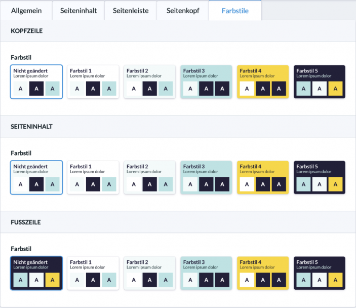
The colour style can be changed for each content. You can choose from several combinations from the colour palette of the theme that is set for the website. You can set the combinations for the header (Kopfzeile), the page content (Seiteninhalt) and the footer (Fußzeile). This way, individual content can stand out but still be in the colour scheme of the website.
